Redesigning My Portfolio for 2020
Chances are, that the front page of this site looks different than during your last visit. This is on me, though, I completely
ditched the previous design and opted for something more personal, more minimalist, more 2020. Around September of last year, I switched to
the globe design you might have seen, as displayed below.
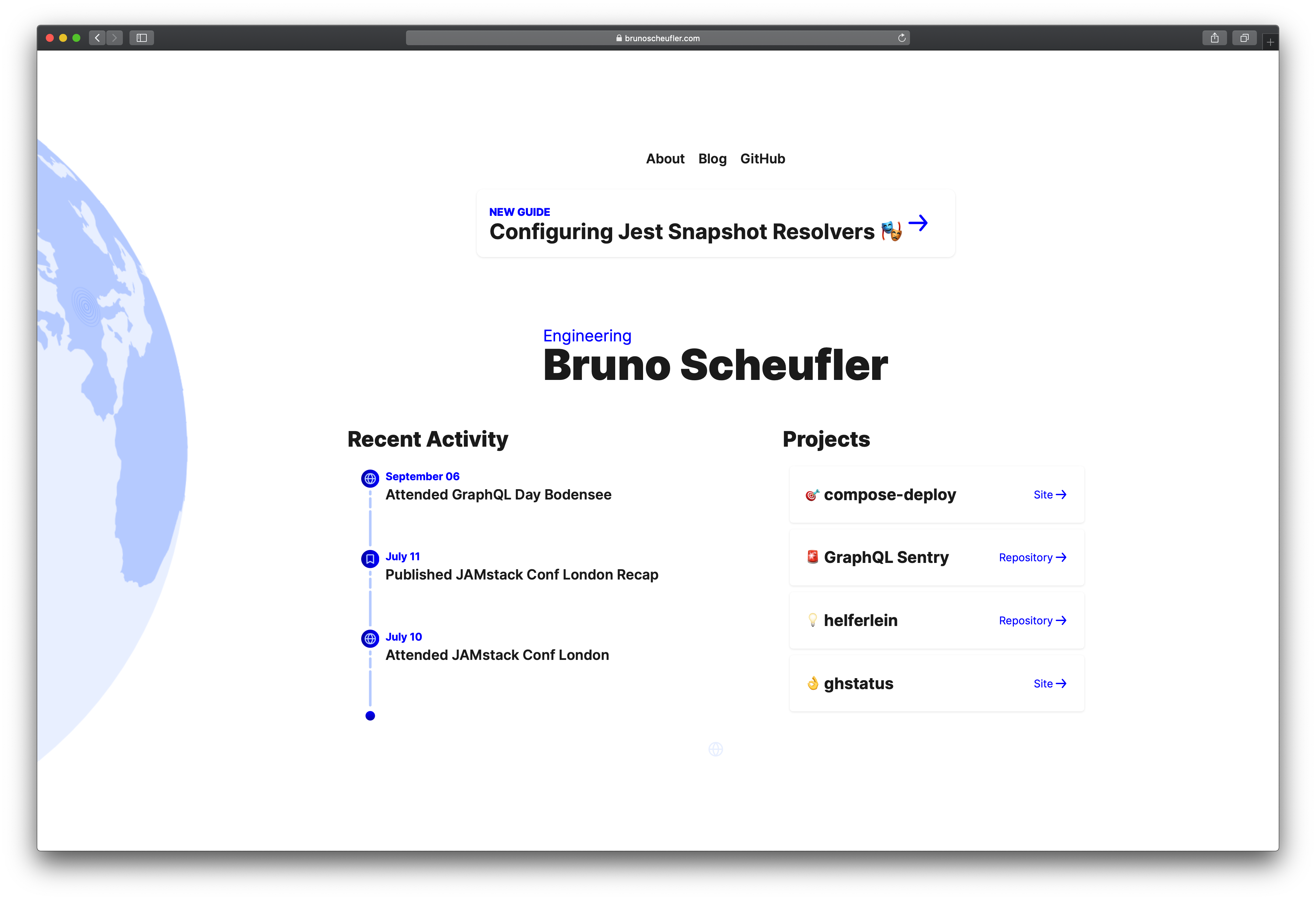
There were some parts about the old design that started to annoy me time and time again, including the timeline section, called Recent Activity,
which I created with a lot of effort (back then, at least) to showcase what I was up to, at any point in time. The issue wasn't with the timeline
itself, but the reality that I didn't have activities to update it with, most of the time. Having a stale timeline looks worse than having no timeline
at all, so that had to go. The project list I did like, hence I wanted to incorporate it again, as well as the notification-style display for the latest
blog post.
Building not only a portfolio but the first page a person will typically observe for their first visit, is the most important page: I believe
it will unconsciously matter as much as the other content I've got around, even if I might not be fond of this fact. It represents the effort I'm putting
into things, the techniques I've picked up over the years. It's basically a living demo of my craft. And as such, it has to contain something bold,
something that is part of my daily work.
While I don't spend all of my time using it, it still represents the engineering and operations skillsets I'm trying to cover, which is why I chose the
Terminal to be the component displayed on the front page. As a matter of fact, I wasn't even planning on redesigning my portfolio at first, but
when I started off with drawing a centered rectangle on the screen, adding a box-shadow to it, and playing around with relative positioning in CSS, ideas
realized faster than I'd have thought of.
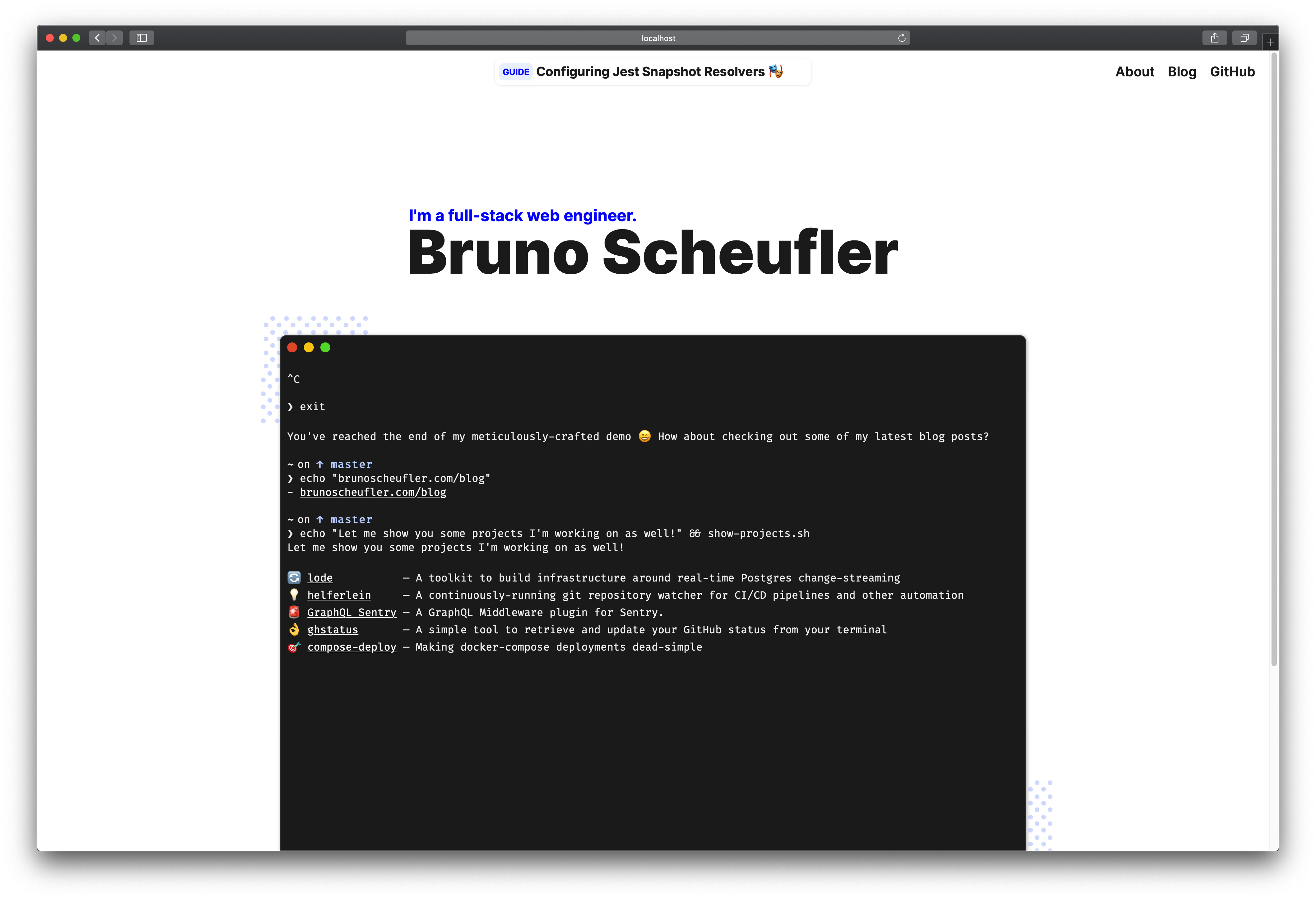
The terminal itself is a component built to render a virtual recording of commands, outputs and other details I put together, resembling a real workflow.
This allows for building a lot of creative scenarios (maybe even making it interactive), which I plan on rotating in the future until this design
gets discarded again. Attached to it, I've added two polka-dot patterns, which seem to be the design trend of the past few months, one I enjoy applying.
If you scroll down to the bottom of the page, you'll be greeted by an animated wave, which is hard to describe with static images. It won't wave around
when you're not viewing it, though, because I had to learn that animating five SVG path elements takes up quite a bit of resources, the hard way.
I might add a few more details when I've got time, but for now, this is more than I had hoped for, so I'll push it for everyone to enjoy.